
The tool that I have been using the most for my Digital Essay that we learned is Voyant. Most of the research I have conducted and have been using so far involves articles that have a lot of writing and not a lot of data. Specifically, one of the articles that Voyant was great for was an article containing quotes of students who were giving their opinion on ChatGPT. I was able to copy and paste the quotes in from the article into Voyant to see what words were most common and it displayed a word map which I will be including in my digital essay. I also plan on attempting to build a map to see if there is a difference on opinion of whether ChatGPT should be used or not in school depending on what part of the US they are form. I plan on using the Datawrapper tool to build this map as I am already familiar with the platform from a previous blog post. I am still struggling to find more data that I could possibly use to create a graphic of some kind but will find something to use for my digital essay. Overall, I feel like this class has shown and given us the tools necessary to build out any type of data visualization and haven’t found the need to find another tool.
Month: March 2023
The Future State
I would tell the future students of this class to be ready for a class that is heavily discussion based where you have to push the boundaries of thought. Taking a DCI class as a first-year and now again as a senior has allowed me to see the class from two different perspectives. As a first-year I wasn’t thinking about life after college where as to now I am thinking about how technology will manipulate the workplace and my job in the future. I would tell students to not be afraid to share their personal thoughts and perspectives even if it differs from their peers as it creates a conversation where people can learn from each other. I would tell them they can prepare for the class by having kept up with the news recently specifically in technology and the growth of artificial intelligence. In addition, I would tell them to prepare to have an open mind so that they can listen to their peers. I think this a good class to take senior year as you are thinking about how technology will effect you academically as well as shifting your mind to life after school and how it will effect your day-to-day life as well as your job. I think all majors and minors are compatible as we haven’t had to be proficient in coding or needing to be an expert in a specific field. Overall, this class will allow students to learn about the trends in technology and the effects it will have within society.
Learning how to Map
Using the CoEducation Report and the data we collected in class I able to create a map to display where people specifically were against integrating Washington and Lee as a coeducational institution. The tool I used was data wrapper which was created by a large institution with a group of people. It was free and I was able to upload my data easily into the program. I simply downloaded the data from the Google Sheet as a .csv file and uploaded it into the browser website. It works for any system and is extremely easily to navigate. The tool accepted .csv files and excel files as well as just copying and pasting your data in raw. There is a step by stop process within the tool which starts with adding your data in and then visualizing it. In these tabs you can add layers, shaped and pins as well as change the size and colors of your points and map. The basemap is just the standard integrated within the website and has so many options, but I specifically chose the plain US map which is where our data is primarily focused in. This tool would suit just about any mapping project and has a tutorial that teaches you how to use the tool to its max potential. Below you can find the basic map I created based on the dataset from class.
What does the Map Say?
The project I decided to look deeper into is Mapping Marronage which is an interactive visualization of the trans-Atlantic networks of enslaved people in the 18th and 19th century. It was created by the Agile Humanities Agency which is a software, design, and consulting collective. According to their website they work with academic researchers and institutions. In addition, Kaiama Glover and Alex Gil worked on the development of the code base. I was unable to find the institutional home and who specifically made up the team, but it seems like this company specializes in digital humanities projects. The map is a historical one and uses letters, testimonies, and financial exchanges by enslaved people of African descent to build out the network. The entire data set is not accessible, however, by interacting with the visualization you can see the various points of data that help build out the map. It even allows users to interact with primary documents that are used at data points. The research questions are not easy to find nor clear but I think they have to do with learning more about the varying types of mobility and legal disputes of enslaved people. How did different enslaved people go about marronage? The analysis being done is a timeline of the flights and networks of various enslaved individuals. It allows users to click on specific names and see their path as well as click on any documents associated with them. The data visualizations are run on the Creative Commons-licenced code originally built to power In the Same Boats. I was able to find this information by going into the about tab to learn more about the project. The website is executed extremely well as it visceral in the sense of visualizing the amount of travel done by the individuals. It is also easy to navigate as I am able to interact with specific individuals as well as see them overlapping with one another. Overall, I thought this project was easy to navigate and engaged users.
Conference Review
During my meeting with Professor Abdoney, we discussed the digital essay and my topic in general. Specifically, I asked her questions around how to best execute the visualization part of my essay. She recommended I use Voyant where I could copy and paste different parts of articles and use that as my text visualization. This was different than my original thoughts because I thought I needed to create a graph of some kind which I thought was going to be difficult based on my topic. One part we discussed that she said would be effective is making sure to take a stance within the essay by bringing in both sides of the argument with multiple perspectives. Professor Abdoney noted how good academic writing is based on having a solid backing to your argument and making sure what you are saying is clear. This was a goal stated by me where I would like to improve my academic writing. Some further steps I need to take is to try and look into data to be able to create some graph or visualization. One thing we discussed is attempting to find what schools are banning ChatGPT and gathering data around that topic to potentially build a map showing where it is more acceptable than others. Overall, I came out of the meeting with a clear understanding of that direction my essay was headed as well as knowing what I needed to take as next steps.
The Proposal
The topic for my project is looking at the relationship between artificial intelligence and education, specifically looking at the rise of ChatGPT and how education systems have reacted. The reason I decided to write my digital essay on this topic is because of the prevalence of artificial intelligence recently and how popular ChatGPT has become. The biggest technology companies in the world are investing heavily into artificial intelligence and are attempting to create something similar to ChatGPT. Some potential research questions are how will schools react to artificial intelligence tools such as ChatGPT and how will it hurt/help the education system? I also plan on researching the history of how ChatGPT came about and why it was created. I plan on doing text analysis and possible data visualization if I can find supportive data. I have not found specific data yet that I could use to make a visualization but plan on doing some more research that would make it possible. I was thinking about maybe using the articles and tallying whether a student or faculty member supported ChatGPT in schools or not. I have done a solid amount of research finding scholarly and non-scholarly articles relating to artificial intelligence and specifically ChatGPT and schools. Here is a link that brings you to the annotated bibliography I created with descriptors of each article. These articles will be extremely helpful in the process of research and creating my digital essay. Success for me will look like learning more about the topic I am researching and presenting a detailed essay on what I have found. Some skills I want to develop is improving my academic writing as well as learning how to collect and present data in the best way possible. Learning more about ChatGPT and its possible competitors is something I am really interested in and think it will be instrumental to the future of society.
Proposed Schedule:
Create Outline for Digital Essay (March 17)
Begin writing essay (March 19)
Finish data visualization (March 24)
Finish essay exam week
Sections:
- Brief History of Artificial Intelligence and ChatGPT
- Artificial Intelligence and Education
- ChatGPT and Education
- Other Artificial Intelligence Tools
- Conclusion and findings
Waiting to talk to Professor on best way to go about digital medium and how to display it.
A Deeper Dive
For this blog post we were tasked with taking a deep dive into a specific text analysis project. I decided to choose the project named “Robots Reading Vogue”. The project takes over a century’s worth of data from the magazine Vogue which contains over 2,700 covers, 400,000 pages, and 6 TB of data. The project was created by Lindsay King and Peter Leonard. Their institutional home is Yale University where King worked in the Haas Arts Library and Leonard worked in the Digital Humanities Lab. There is no list of who made up their team and is described as a “joint project” between the two. They are both librarians with Leonard interested in humanities and King interested in fashion. The corpus and source of data is the Vogue archive which includes 6 TB of data. When I interacted with the various experiments within the project I was able to find a link to the Vogue Archive where they are pulling their data from. There are several experiments and different research they conducted using the data. One question they explored was how the notion of beauty has shifted within the Vogue and used temporal word embeddings to help answer this question. A lot of their research involves exploring the shifts in theme and industry within fashion over periods of time which they use and n-gram and data visualizations to depict. There are also 3 projects that are done by students look at facial and body language as well as an analysis of skin color in fashion photography. The type of text analysis being done includes n-gram search, topic modeling, statistic analysis, and much more. This project does a great job at exploring various types of text analysis. One example is experiment with advertisements where ether look at the sorts of ads by frequency, date, and industry within Vogue over the years. A lot of the data is counting words and phrases to help paint a larger picture and theme which is necessary with such a large set of data. I feel like the design of the website is simplistic and easy to navigate. The various experiments are displayed on the home page and have titles for the various types of analysis. They allow the user to easily dive deeper if they desire by clicking on the explore tab beneath each one. The data visualizations are also shown below and you can look at them in more detail if you click on it. Overall, I thought this project did a great job at evaluating Vogue over time and really shows the power of text analysis and the advancement of technology.
Visualizing Data
My experience crafting these visualization was slightly difficult. The Coeducation Report given to us did not contain a large amount of data to be able to create several different visualizations for. I was eventually able to find a part of the report that had a large data set that I knew would work well to visualize. My visualizations are accessible as I have included the data set at the bottom of the post as well as the file I used to create the first two data visualizations in Excel. I would improve the visualizations if I had more time by looking at the report more in depth and tracking every aspect of data I could find so that I created a comprehensive report. This comprehensive report would allow me to create several different visualizations instead of the same data set I have know. Some help resources I used along the way included previous articles and videos we had for homework as well as looking up how to exactly use RAWGraphs which I think I still have a lot to learn on. One way I could visceralize the data is to highlight the part of each visualization showing how strong the case for “con” is in the data set. I could also add in a little point of how there is an overwhelming opposition to coeducation for those who graduated before 1950 and less division among alumni who graduated after 1949. This would help add another layer to understand the data better as it could be confusing with no context
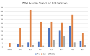
Pictured above is data collected from the coeducation report. It specifically is looking at the letters written from alumni and tracking their stance if Washington and Lee should be changed.
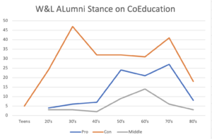
The same data set is shown above through a line chart.
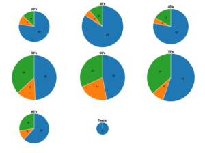
The data set is shown above using several different pie graphs. Each pie graph is a different decade. I created this using rawgraphs.io.
The data set I used can be found here: Coeducation Report Data
| Decades | Pro | Con | Middle |
| Teens | 5 | ||
| 20’s | 4 | 24 | 3 |
| 30’s | 6 | 47 | 3 |
| 40’s | 7 | 32 | 2 |
| 50’s | 24 | 32 | 9 |
| 60’s | 21 | 31 | 14 |
| 70’s | 27 | 41 | 6 |
| 80’s | 8 | 18 | 3 |
Exploring IBM
I decided to take a deeper dive into the IBM website because it was one of the first websites that came up when I Googled “artificial intelligence”. IBM is an extremely old company being founded in 1911 and is a technology corporation with a presence all over the world. The website’s primary focus is to provide information relation to the company. The main tabs it has at the top of the website are “Products”, “Solutions”, “Consulting”, and “Support”.
The website homepage does not really execute any sort of functions and is there to provide information on the company. I know what the website can do by interacting with it. For instance, the top tabs have down arrows next to each word so that I know if I click on it, more information will appear for me to interact with. Also by scrolling down on the website I can see more information and links for me to link once I hover my mouse over them.
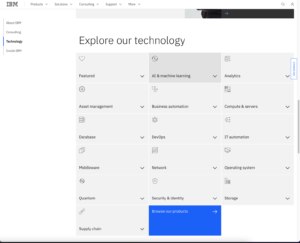
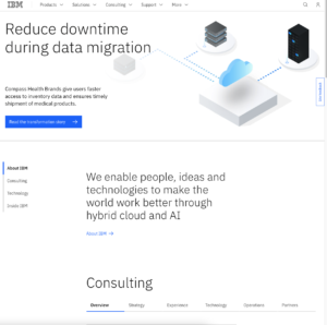
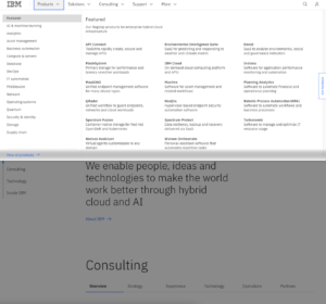
Looking at the website and its observing its sensory affordances I think it represents an extremely simplistic feel. The website is not too crowded with the main color being primarily white and a lot of empty space in general. There is a simple image at the top of the website with not too flashy colors and graphics.
In regards to the feel of the website it does feel simple, but when I clicked on the tabs at the top such as “Products” I was overwhelmed with too many options making it difficult to navigate what exactly I was looking for. I also cannot hear anything coming from the website as there are no videos or sound effects playing.
Lastly, I used the Wayback Machine to look at the website several years ago. Below is an image of the website on August 1st, 2017.
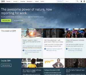
As you can see the image looks a lot different from what the website looks like today. It is covered in color and articles with very little white space like the website today. I think this a great example of how society has turned to simplistic aesthetics instead of unique and in your face like it was before.